
By Rory Gilchrist
We like books here at SJC, especially really pretty ones. It’s no secret that I’m a sucker for elegantly designed literature. The library has a facsimile of Carl Jung’s Liber Novus (link for a sample of the layout and the illustrations) that I take of the shelf and marvel at when I have nothing better to do in the library.
So when I saw this post on one of my favorite graphic design blogs, I was enthralled. It’s like Euclid meets Gutenberg meets Da Vinci meets Le Corbusier. Take a look:
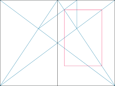
The blog post argues that throughout the history of the printed page, people have naturally gravitated towards certain layouts, layouts based on certain proportions, which when combined result in the perfect book. Whether or not you choose to believe it’s because those ratios are instrinsically divine, well, that’s up to you. They sure look cool.
Taking a break from my math paper, I channelled Euclid in a different way. Taking a straightedge to my copy of Lavosier’s Elements of Chemistry. Sure enough, the lines fit. Guess there’s something to all this crazy lines in crazy directions.

0 comments on “The Perfect Book (gasp!)”